.png)
The Art of Colour Drenching
- Holly Ayre
- Sep 24, 2025
- 3 min read

The Bold Interior Design Trend You’ll Want to Try
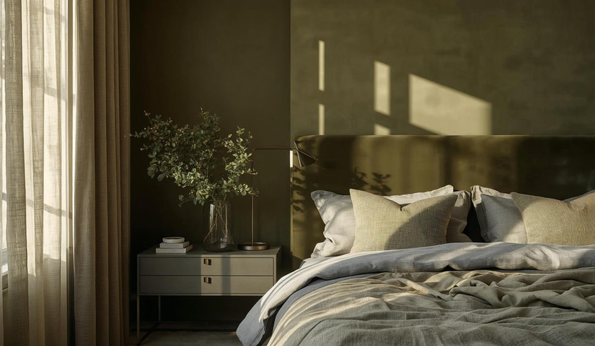
If you’re ready to move beyond feature walls and subtle accents, colour drenching might be your new design obsession. This striking technique takes one colour — or closely related shades of it — and extends it across an entire room. Walls, ceilings, doors, woodwork, radiators, furniture, and even fabrics are all wrapped in the same hue, creating an immersive, cocoon-like atmosphere.
Instead of contrast, colour drenching is all about harmony. Every surface blends, erasing boundaries and giving your space a confident, modern edge.

The effect is immersive and cocooning, creating a strong mood and atmosphere. Here’s a breakdown:
1. Cohesion:
It helps to unify various elements in a room, making them feel like part of a whole rather than separate pieces.
2. Mood Setting:
The choice of colour can significantly affect the mood of a space. For instance, soft blues and greens can create a calming atmosphere, while bright yellows and reds can energise a room.
3. Visual Depth:
Using varying shades of the same colour can add depth and interest without overwhelming the space.
4. Textural Contrast:
To avoid monotony, incorporating different textures through furniture, fabrics, or decor can enhance the overall effect of colour drenching.
5. Focus on Lighting:
The colour can change significantly under different lighting conditions, so it's essential to consider natural and artificial light when choosing your colour.


Key Features
All-Encompassing Paintwork:
Walls, ceilings, and trims painted in the same or tonal shades.
Matching Decor:
Furniture and soft furnishings echo the colour palette, sometimes blending in completely.
Minimal Contrasts:
White ceilings and trims are swapped for seamless colour continuity.
Subtle Variation:
Matt walls paired with glossy trims or satin doors introduce interest without breaking the flow.
Why Use Colour Drenching?
Creates Atmosphere:
Dark tones feel enveloping and dramatic, while pale hues feel expansive and airy.
Adds Cohesion:
A brilliant trick for awkwardly shaped rooms or spaces with lots of architectural features.
Makes a Statement:
Bold, modern, and unapologetic — jewel tones and moody neutrals shine here.
Versatile Appeal:
Works beautifully in both small and large spaces. Deep shades make small rooms feel cosy, while light tones enhance openness.
Tips for Success
Choose the right hue:
Rich & dramatic - navy blue, emerald green and burgundy
Soft & calming - pastels and muted neutrals
Playful & contemporary - mustard, teal and coral
Play with Finishes
Matt walls with satin or gloss trims create depth without introducing new colours.
Layer textures - think velvet cushions, linen curtains, glossy ceramics, and matt paint, texture keeps the room dynamic.
Lighting is everything - colours shift under different lighting, so test swatches in both natural and artificial light.
Tone-on-tone accents - layer slightly lighter or darker shades of the same colour (a forest-green sofa against moss-green walls, for example) to add dimension.
If you’re thinking about trying colour drenching, there are a few “don’ts” worth keeping in mind so your space feels intentional rather than overwhelming.
First off, don’t ignore lighting - colours can look completely different in daylight compared to warm evening light, so always test your shade at different times of day. Don’t just pick a colour because it’s trending either; what looks amazing on Instagram might feel too heavy or impractical in your own home. To keep the look from falling flat, don’t forget about contrast and relief - textures like wood, velvet, or stone add depth and keep things interesting. Be careful with undertones too, because mixing warm and cool shades of the same colour can make a room feel “off.” And think about the function of your space - what feels cosy in a snug might feel oppressive in a home office or kitchen. If your room is open plan colour drenching can be rather difficult to master as it's hard to know where to start and stop due to the size of the room
Preparation is also key; when every surface is the same shade, cracks or uneven walls stand out more than ever, so don’t skip the prep. Pay attention to ceilings as well - drenching them lowers the visual height of a room, which can be cosy or claustrophobic depending on the space. Don’t neglect your furnishings either; they should complement or soften the drench, not clash with it. And remember, colour drenching isn’t just about moody jewel tones - soft pinks, sage greens, or warm neutrals can be just as effective.
Finally, don’t feel like you need to drench every single room - sometimes the contrast between bold, drenched spaces and lighter ones creates the most beautiful balance.
Colour drenching isn’t for the faint-hearted, but it’s one of the most effective ways to create an atmosphere that feels intentional and immersive. Whether you’re drawn to deep jewel tones that wrap you in luxury or airy pastels that expand your space, this trend proves that sometimes, more really is more.


Comments